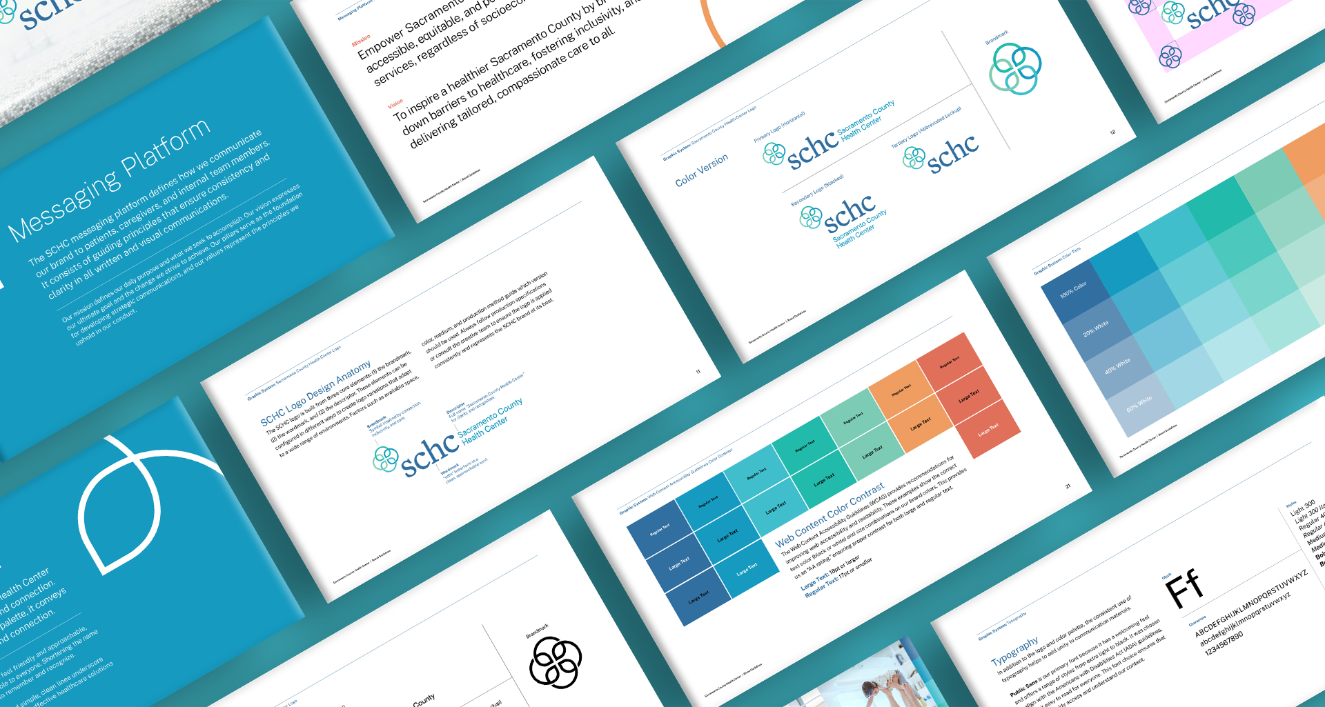
Client Name
Sacramento County Health Center
Project Type
Healthcare Brand Identity & Visual System
Role
Brand identity + voice
- Designed logo and executed visual identity system
- Defined color, typography, and style guide
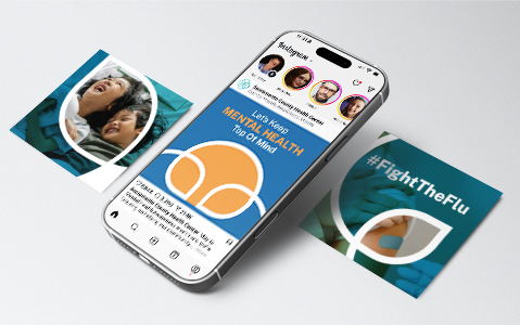
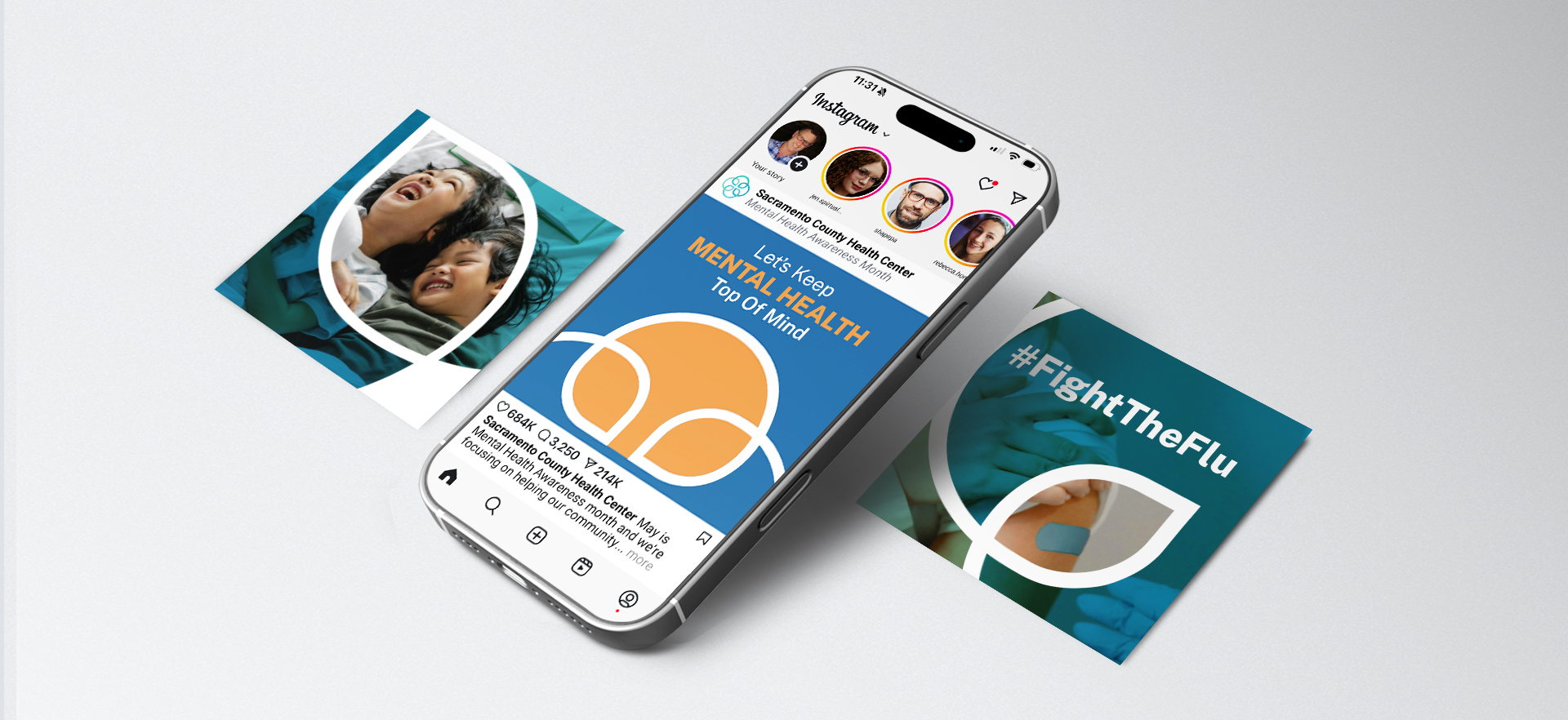
- Executed OOH and social media assets
Deliverables
Brand system + guidelines
Marketing + patient materials
Website + digital communications
Signage + wayfinding