Branding Versatility

A scalable enterprise visual system designed to unify ARxIUM’s growing pharmacy automation ecosystem. Built a modular identity framework that brought consistency across products, campaigns, and real-world environments without altering core brand equity. The result was a disciplined design system that helped ARxIUM communicate with clarity at scale.

View Challenge + Results

The Challenge
ARxIUM’s visual presence lacked cohesion beyond its logo and core red-and-blue palette. As the company’s portfolio expanded, there was no unifying structure to consistently express its products or messaging across touchpoints.

Compounding the challenge, the logo and primary colors were client-defined and off-limits — requiring the solution to come from system design, not surface-level change.

The Approach
Rather than redesigning the brand, I focused on building a scalable visual framework that could organize complexity and adapt across real-world use cases.

I began by assessing how ARxIUM’s products and communications functioned across marketing, sales, and environmental contexts — identifying the need for a unifying enterprise structure rather than a stylistic overhaul.

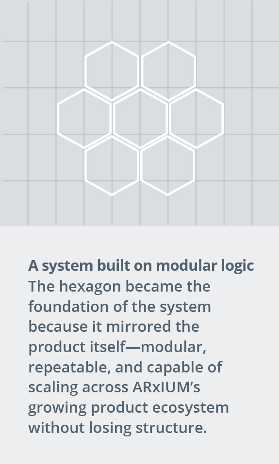
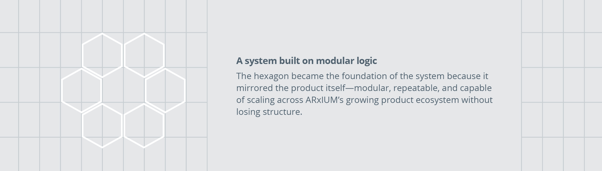
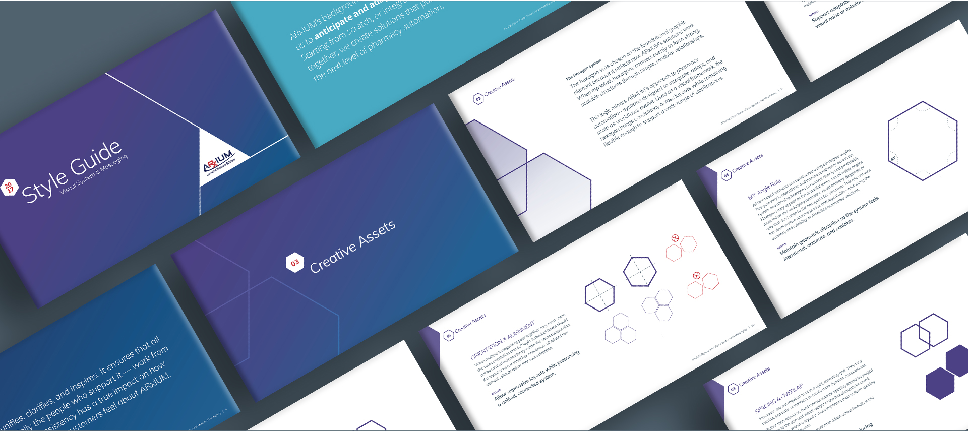
A hex-based modular system became the foundation, providing a flexible way to organize information and scale layouts across formats.

Working within the fixed logo and palette, I developed a comprehensive identity system including:

  • Typography standards
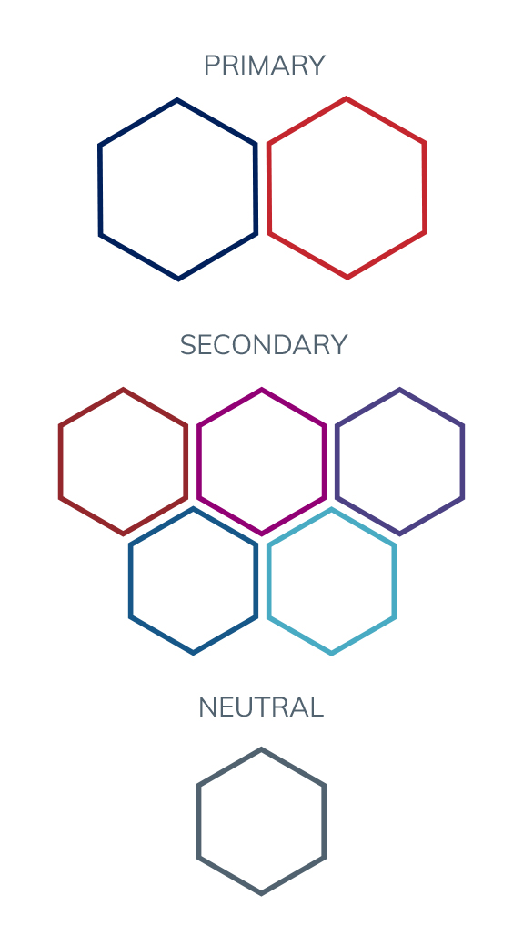
  • A supporting secondary color palette
  • Aligned product logos and hierarchy
  • Modular layout rules
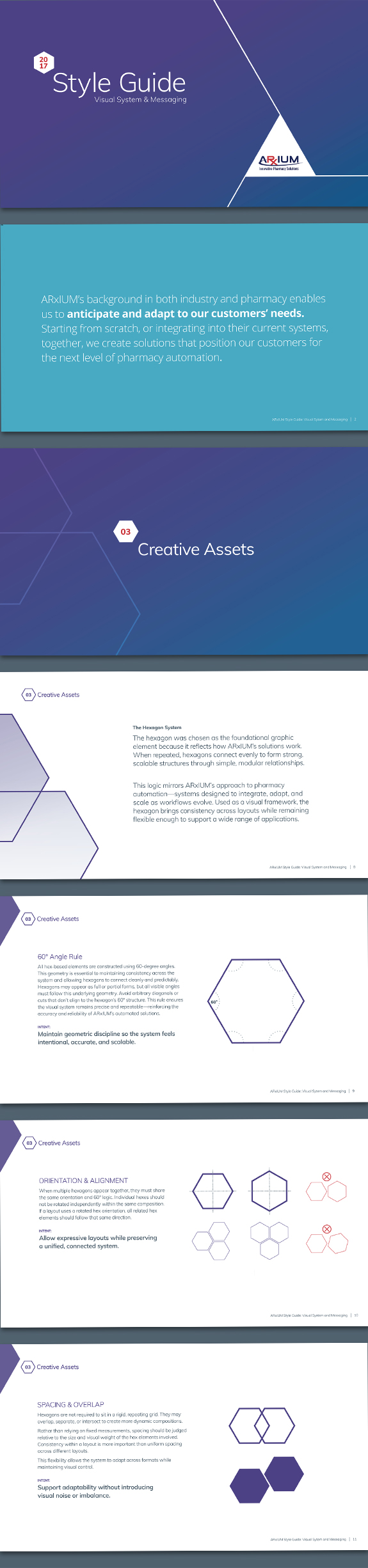
  • Practical documentation through a working style guide

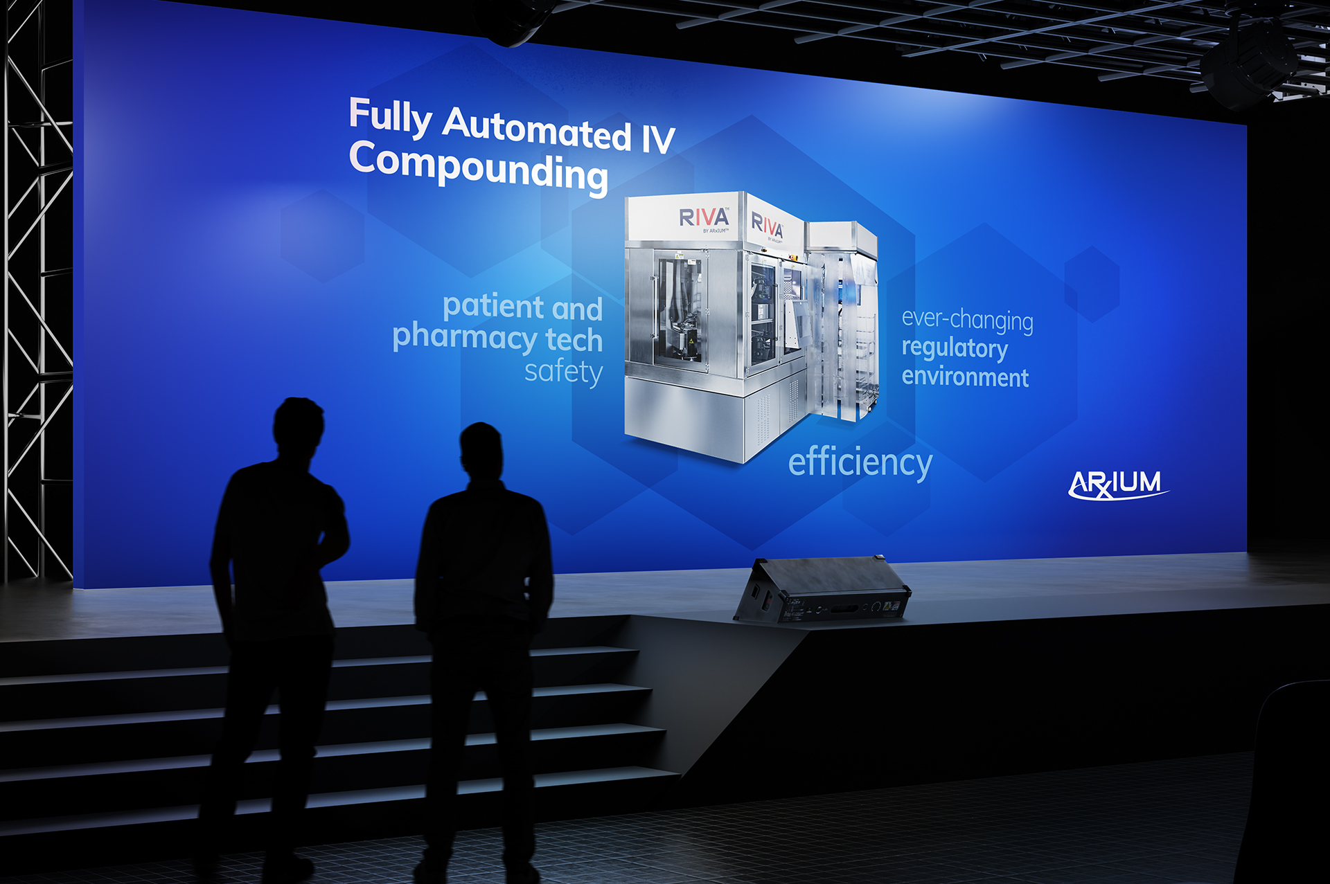
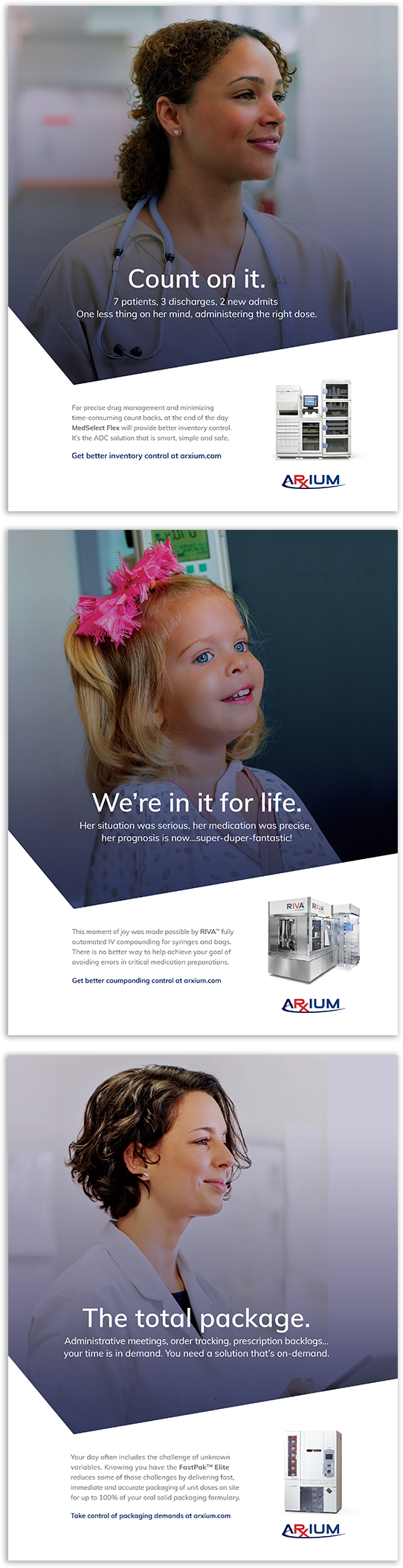
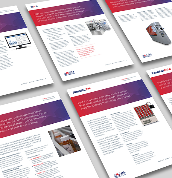
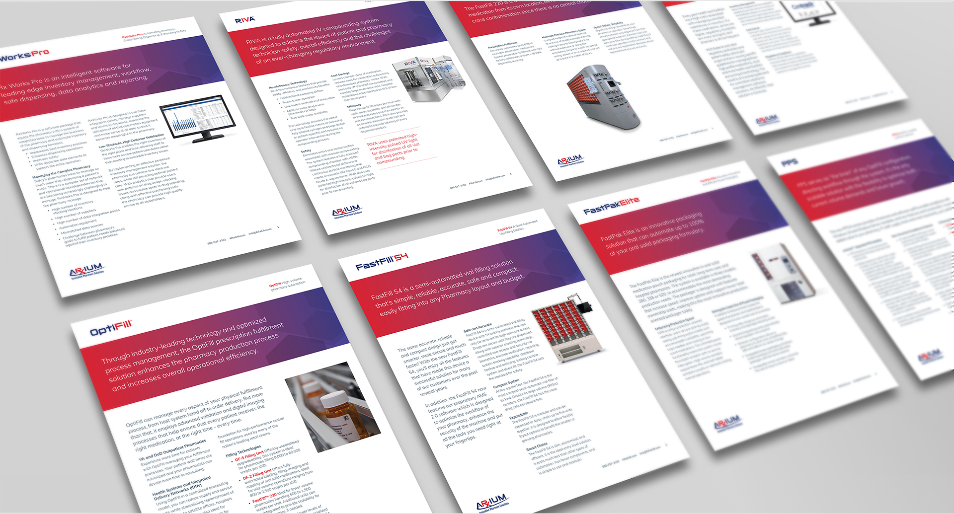
The system was then applied across print and digital campaigns, product marketing, environmental graphics, and supporting collateral — ensuring consistency without sacrificing flexibility.

Results
The visual system brought clarity and cohesion to ARxIUM’s growing product ecosystem, enabling the brand to scale across communications, environments, and materials without disrupting existing equity.

Leadership recognized the system’s ability to express ARxIUM’s approach to problem-solving with consistency across touchpoints.

Why it Worked
This work succeeded by focusing on structure over cosmetic change. By designing within clearly defined constraints, the identity system provided a disciplined framework that could scale across products and applications — maintaining clarity in a highly regulated and evolving healthcare space.

Client Name
ARxIUM
Project Type
Enterprise healthcare automation brand identity & visual system
Role

Senior Art Director
Identity system + rollout

Deliverables

Modular visual system

Templates + product collateral

Environmental + launch assets

A scalable enterprise visual system designed to unify ARxIUM’s growing pharmacy automation ecosystem. Built a modular identity framework that brought consistency across products, campaigns, and real-world environments without altering core brand equity. The result was a disciplined design system that helped ARxIUM communicate with clarity at scale.

Exposing the deception that costs lives
The campaign led viewers to a landing page where they could learn the facts and see real stories of lives lost to deception.
By focusing on deception, the message connected with a broader audience and showed how easily trust can turn fatal.
Unifying a fragmented brand with a scalable visual system built around ARxIUM’s modular product platform

Designing within fixed brand constraints

At the client’s request, ARxIUM’s logo and primary color palette remained unchanged. The system was intentionally designed to deliver clarity and consistency without altering the core brand.

Extending the palette without redefining the brand
Selected pages from the guidelines
Applying the system at scale across real-world environments
Designed to hold up at scale—where clarity and consistency matter most.
A unified campaign flexed across distinct product messages.
Unifying the product portfolio.
Deploying the system across product-specific marketing and sales materials.
The result is a cohesive visual system built to bring clarity and consistency to a complex product ecosystem—across campaigns, environments, and supporting materials
An unseen predator waits for your guard to drop, the real cyber threat is human error
Downloadable educational content translated complex security risks into clear, actionable insights.
By making the invisible visible, this campaign helped organizations recognize the threat sooner and act before they became the target
The feeling of summer camp through imagination and scale
Extending the visual system into the camp experience itself.
Bringing the visual language into real-world engagement.
Helping families see camp not just as an activity—but as something bigger.
PREV PROJECT
NEXT PROJECT
PREV PROJECT
NEXT PROJECT
PREV PROJECT
NEXT PROJECT
PREV PROJECT
NEXT PROJECT