Brand Strategy
Messaging
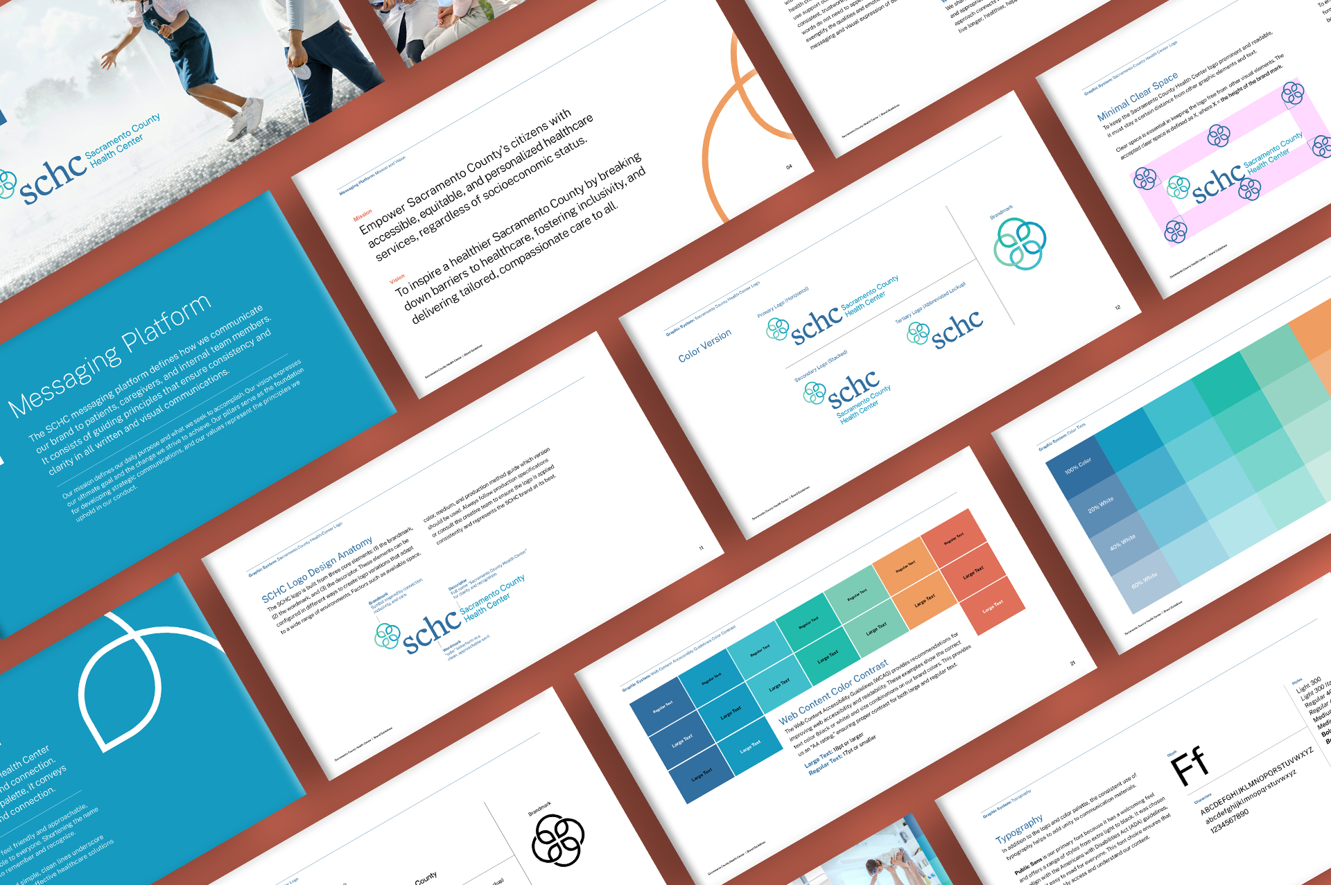
Visual Identity System
Brand Guidelines
Sacramento County Health Center (SCHC) serves a diverse community of first-generation immigrants and families facing socioeconomic challenges. Previously, SCHC existed only as a small section within the Sacramento County government website — buried among administrative content and without a distinct voice or visual identity.
The goal was twofold: to give SCHC a recognizable brand of its own and to challenge common perceptions of state-funded healthcare — showing that it can be caring, accessible, and provide comprehensive, high-quality care to its community.
The Challenge
Without an independent brand presence, SCHC struggled to connect emotionally with the people it served. The lack of identity made it feel impersonal and bureaucratic, reinforcing the misconception that public healthcare is cold or subpar.
The challenge was to create an identity that elevated SCHC from a faceless county program to a welcoming, trustworthy health center — projecting professionalism with warmth, and delivering clarity while inspiring confidence and belonging.
The Approach
Rooted in the ideas of connection and community, the new identity centers around a circular logo symbolizing people coming together through care and collaboration. A calm palette of approachable blues and teals pairs with modern neutrals to evoke trust, comfort, and inclusivity.
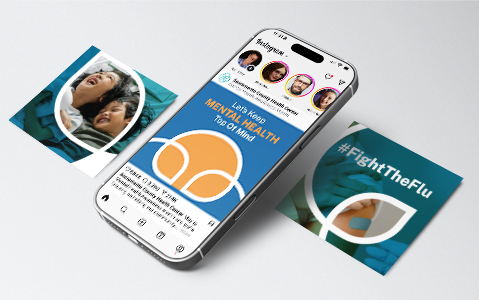
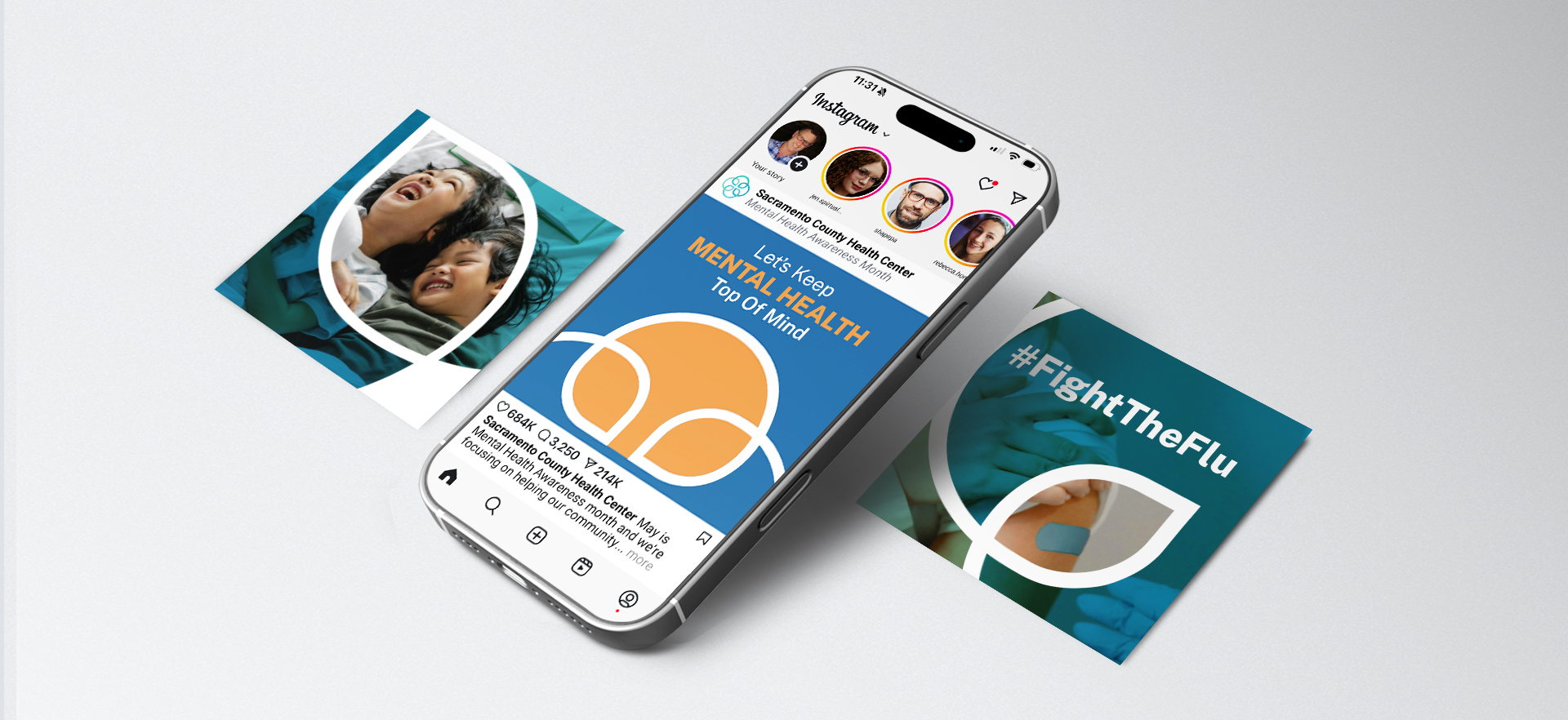
The system was designed to extend seamlessly across digital, print, and environmental touchpoints — ensuring accessibility, cultural relevance, and consistency across all communications.
Results
The new brand gave SCHC a voice of its own within Sacramento County’s public health network — one that feels human, confident, and modern. With a unified visual and messaging framework, the center now communicates more clearly, builds stronger community trust, and establishes a foundation for future outreach and growth.
Why it Worked
By blending thoughtful design with human insight, the SCHC identity helped redefine perceptions of government-funded healthcare — from impersonal to empathetic, from bureaucratic to trusted.The result is an approachable, inclusive brand that replaces anonymity with authenticity and gives the community a healthcare center they can truly connect with.
Brand Strategy
Messaging
Visual Identity System
Brand Guidelines
Sacramento County Health Center (SCHC) serves a diverse community of first-generation immigrants and families facing socioeconomic challenges. Previously, SCHC existed only as a small section within the Sacramento County government website — buried among administrative content and without a distinct voice or visual identity.
The goal was twofold: to give SCHC a recognizable brand of its own and to challenge common perceptions of state-funded healthcare — showing that it can be caring, accessible, and provide comprehensive, high-quality care to its community.


Inspired by the strength found in connection, inclusivity, and the cross as a symbol of care, the SCHC logo reflects a brand rooted in community, compassion, and accessible healthcare.

Inspired by the strength found in connection, inclusivity, and the cross as a symbol of care, the SCHC logo reflects a brand rooted in community, compassion, and accessible healthcare.


A palette designed to convey trust, warmth, and accessibility through the forms and colors that define the SCHC visual brand.