The Challenge
Fentanyl was claiming lives at an alarming rate, but the messaging surrounding it wasn’t connecting. Most campaigns focused on fentanyl itself—using tribute imagery or shock tactics that left viewers feeling detached from the risk.
People didn’t see themselves in those messages.
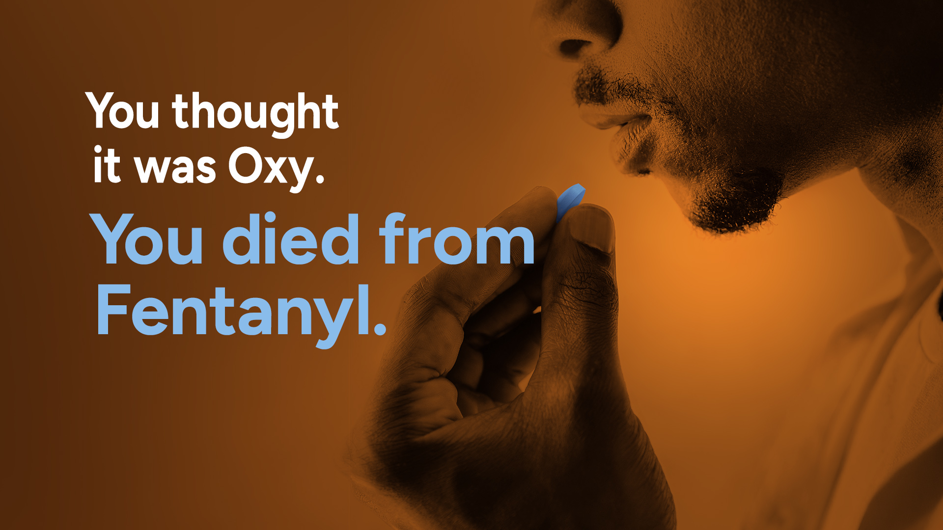
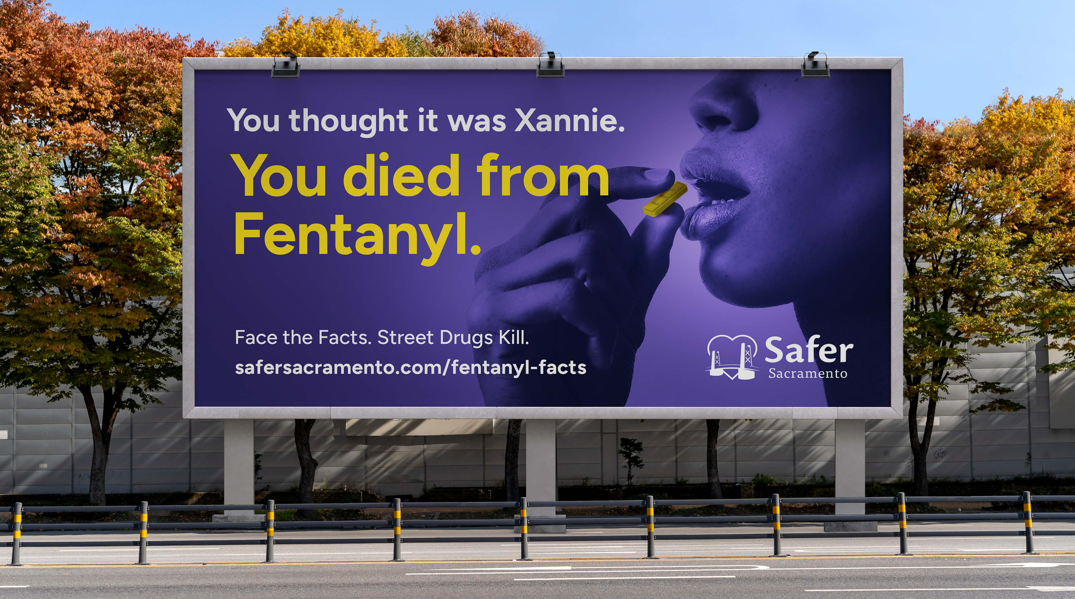
The real danger wasn’t fentanyl alone—it was deception. Everyday people were purchasing what they believed were familiar prescription drugs like Xanax, Percocet, or Oxycodone. They weren’t seeking fentanyl. They didn’t know it was there.
That false sense of familiarity was costing people their lives.
The challenge was to expose that deception clearly and directly—so people could recognize how easily this could happen to anyone.
The Approach
I realigned the messaging to focus on the moment of deception.
Instead of focusing on fentanyl as a substance, the campaign confronted the mistaken belief that what someone thought they were taking was safe. The core message—“You thought it was Xanax. You died from fentanyl.”—collapsed assumption and outcome into a single, undeniable truth.
This approach removed distance and made the risk personal. It showed how a single moment of trust in something familiar could lead to irreversible consequences.
The system was designed to scale across outdoor, transit, and digital placements, reaching people in everyday environments where that trust exists.
Results
The campaign reached over 559,800 people and generated 412,000 impressions and 32,000 engagements across outdoor and digital placements.
It drove a 7.8% engagement rate and increased the organization’s social audience by over 1200%, demonstrating the message resonated deeply with audiences.
The work was also recognized with three Shorty Impact Awards, alongside campaigns from MTV and UNICEF.
Why it Worked
The campaign worked because it exposed the truth people hadn’t considered.
It shifted the focus away from fentanyl as an abstract danger and revealed the real risk—deception. By confronting viewers with the reality that victims believed they were taking something familiar, the message became immediate, personal, and impossible to dismiss.
It showed that this isn’t about who you are. It’s about what you think you’re taking—and what’s actually there.
Strategy + campaign execution
- Developed strategy, brief, and campaign concept
- Designed OOH, transit, social, and collateral
- Built production files and prepared rollout assets
- Partnered with copy to shape messaging and voice
OOH campaign system
Social + landing page creative
Print + outreach assets