The Challenge
Social engineering attacks don’t resemble traditional cyber threats. They appear as familiar emails, messages, or requests, making them difficult to detect and easy to trust. This makes employees the primary entry point, often without realizing they’ve been targeted. Webroot needed a way to reveal this invisible threat while reinforcing its role as a trusted security partner.
The Approach
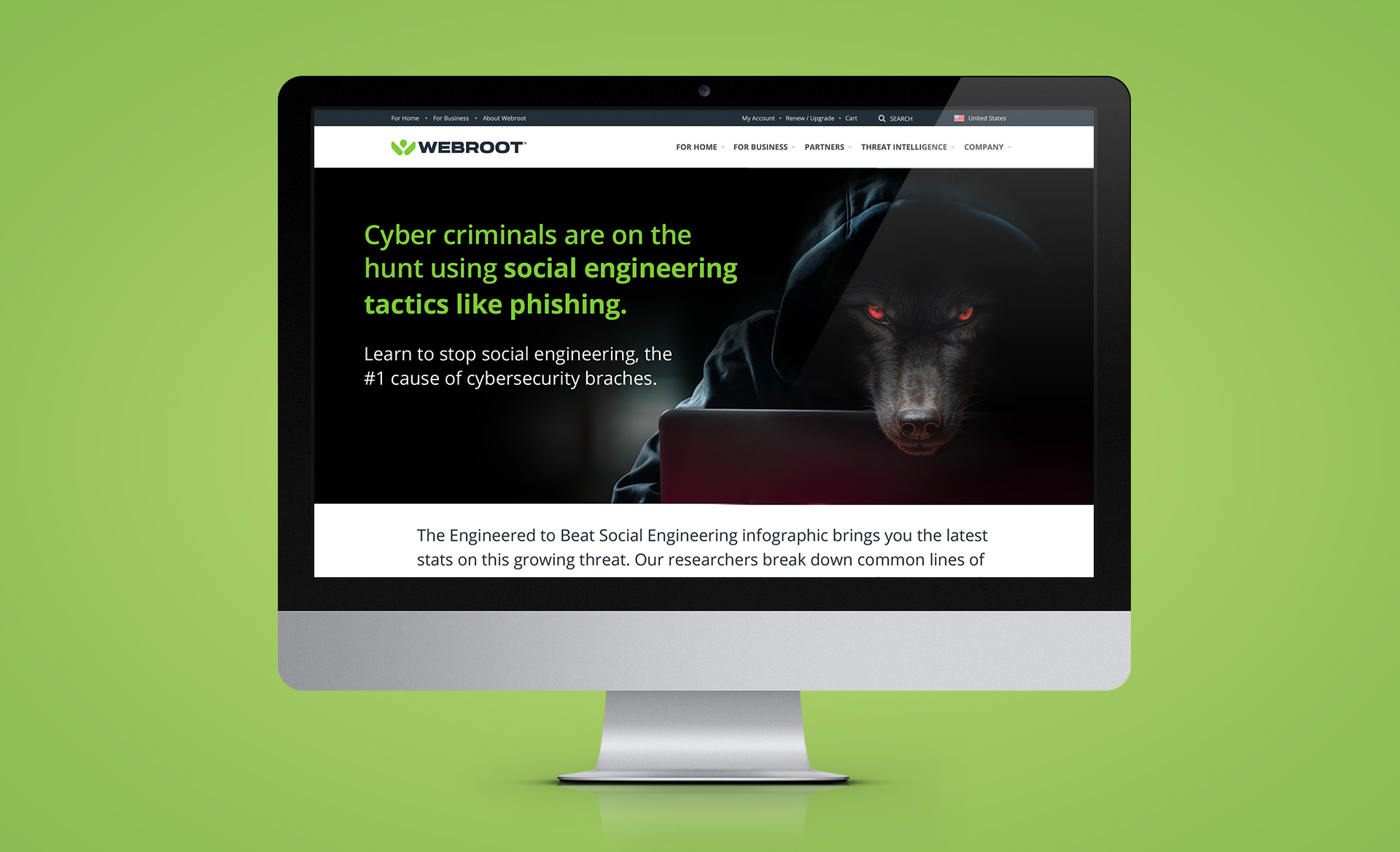
I developed a campaign built around the metaphor of a concealed predator — a visual and narrative system that made the invisible threat tangible and emotionally immediate. The wolf became the embodiment of the attacker: intelligent and patient, waiting for the right moment to strike. The campaign extended across digital ads, landing pages, and educational content, guiding audiences from awareness to understanding and ultimately toward protection.
The Results
The campaign transformed an abstract cybersecurity concept into something immediate and recognizable. By reframing social engineering as a human vulnerability rather than a technical one, the work created a stronger emotional connection while reinforcing Webroot’s position as a proactive defense against emerging threats.
Why it Worked
By focusing on psychology instead of technology, the campaign made the threat easier to understand and harder to ignore. This shift helped organizations recognize how trust could be exploited — and positioned Webroot as the partner capable of helping them stay protected.
Concept + execution
- Developed campaign concept and visual direction
- Designed hero and infographic system
- Led rollout across digital, social, and landing
Campaign concept + visual system
Digital + social campaign assets
Landing page
Infographics