Poster
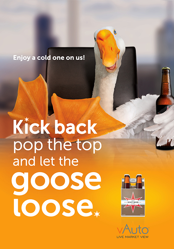
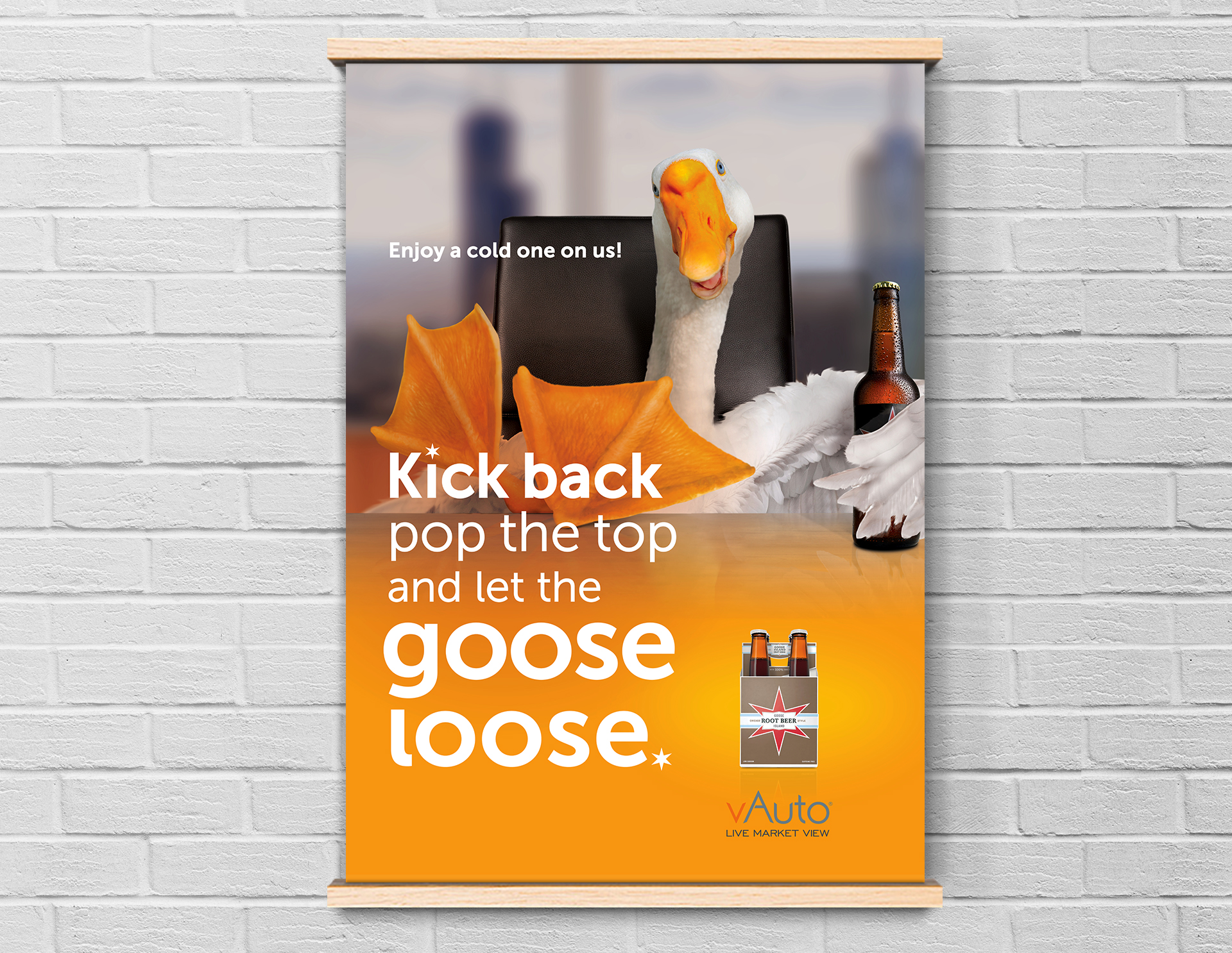
Every year, vAuto sends a thoughtfully chosen gift to its customers as a gesture of appreciation. For this year's gift—a case of Goose Island root beer along with this poster—I developed a playful concept that ties together the Chicago-based roots of both vAuto and Goose Island. Drawing inspiration from the company's high-rise view of downtown and the local flavor of the gift itself, I imagined a whimsical scene: a relaxed goose perched high above the skyline, taking a well-earned break with a cold bottle of root beer in hand (or wing). The illustration celebrates both the brand and city with personality and charm, turning a simple thank-you into a memorable moment.

Poster
Every year, vAuto sends a thoughtfully chosen gift to its customers as a gesture of appreciation. For this year's gift—a case of Goose Island root beer along with this poster—I developed a playful concept that ties together the Chicago-based roots of both vAuto and Goose Island. Drawing inspiration from the company's high-rise view of downtown and the local flavor of the gift itself, I imagined a whimsical scene: a relaxed goose perched high above the skyline, taking a well-earned break with a cold bottle of root beer in hand (or wing). The illustration celebrates both the brand and city with personality and charm, turning a simple thank-you into a memorable moment.