Visual Brand Design
Style Guide
Collateral Design
Iconography
Print Advertising
Digital Advertising
Product Identity Design
Event Design
ARxIUM is a pharmacy automation and workflow solutions company with a competitive edge rooted in its ability to adapt—whether by building complete systems from the ground up or working within existing infrastructures using a modular approach. When their visual brand no longer reflected this versatility, I developed a new identity system designed to bring clarity, consistency, and sophistication to every touchpoint. The result is a modern foundation that not only unifies their communications but also reinforces the story of problem-solving built to flex.

The Challenge
Their original visual identity lacked cohesion and failed to communicate ARxIUM’s strongest differentiator: versatility. To complicate matters, the logo and primary color palette (red and blue) were off-limits, limiting options for change.
The Approach
I began by interviewing leadership and analyzing the visual landscape, where sameness—especially in color—was rampant. Inspired by ARxIUM’s modular solutions, I introduced the hexagon: a shape that reflects flexibility, connection, and scalability.
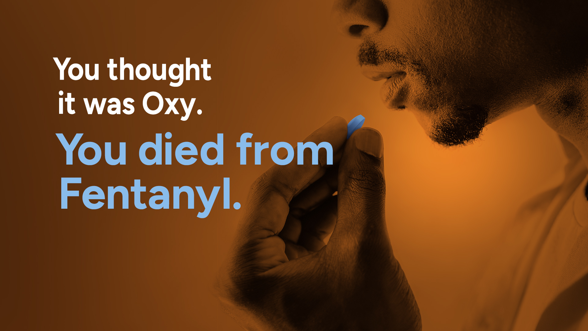
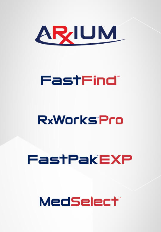
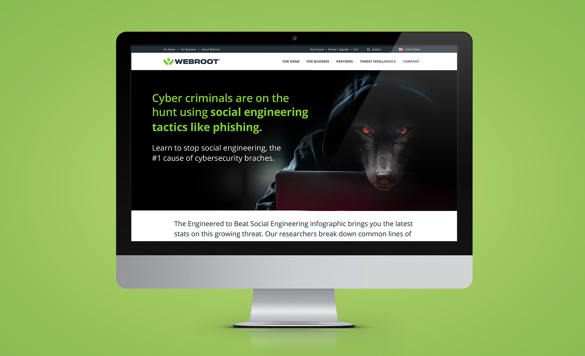
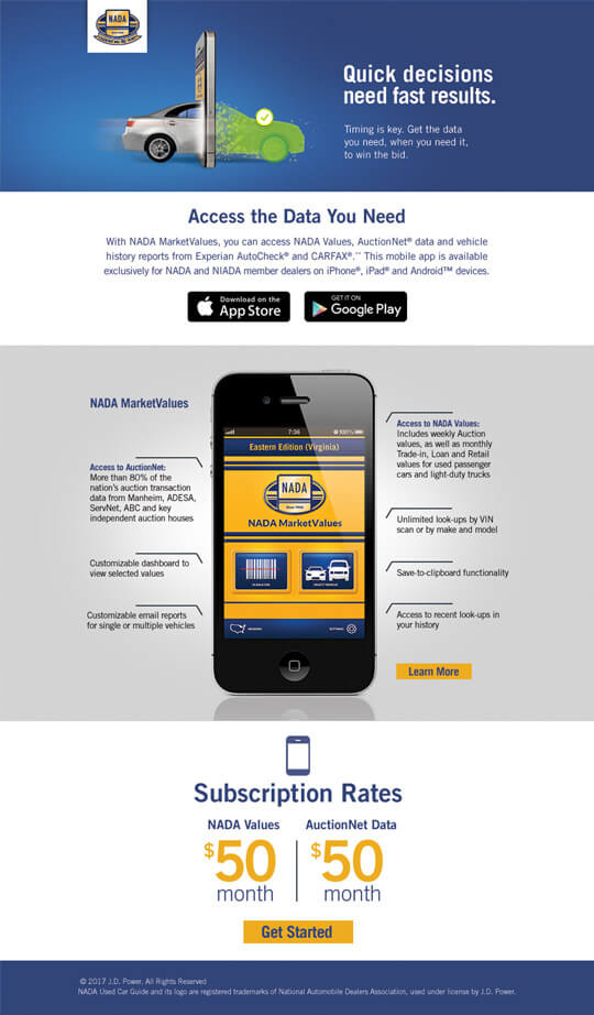
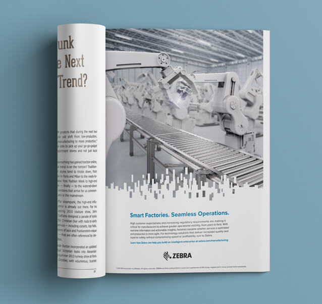
Building around this core idea, I created a design system that included modern typography, a complementary secondary palette, unified sub-brand logos, a custom icon set, and a comprehensive style guide. The system was rolled out across print and digital advertising, marketing materials, event signage, and environmental graphics.
Results
The refreshed identity positioned ARxIUM as a forward-thinking, agile leader in pharmacy automation. Leadership praised the brand for clearly expressing its core value: adaptable problem-solving. And in an unexpected nod to its impact, a top competitor soon introduced hexagons into their own branding—though not nearly as effectively.
Why it Worked
This wasn’t a cosmetic update—it was a strategic visual system built around ARxIUM’s real-world strengths. By working within constraints and focusing on storytelling through design, I created a brand identity that’s modern, meaningful, and built to adapt.
Visual Brand Design
Style Guide
Collateral Design
Iconography
Print Advertising
Digital Advertising
Product Identity Design
Event Design
ARxIUM is a pharmacy automation and workflow solutions company with a competitive edge rooted in its ability to adapt—whether by building complete systems from the ground up or working within existing infrastructures using a modular approach. When their visual brand no longer reflected this versatility, I developed a new identity system designed to bring clarity, consistency, and sophistication to every touchpoint. The result is a modern foundation that not only unifies their communications but also reinforces the story of problem-solving built to flex.
